William Shakespeare Book Collection
This editorial project outlines the complete creation of a custom die-cut book collection designed to bring three iconic plays by William Shakespeare Hamlet, Romeo and Juliet, and Antony and Cleopatra to a contemporary reading audience.
This editorial project outlines the complete creation of a custom die-cut book collection designed to bring three iconic plays by William Shakespeare Hamlet, Romeo and Juliet, and Antony and Cleopatra to a contemporary reading audience. The core creative ambition was to demonstrate how modern editorial design can revitalize classic literature through striking die-cut cover techniques, deliberate color systems, and a carefully structured interior layout. The project encompasses every stage of editorial development, from initial concept definition and target audience profiling to full page layout, cover design, promotional collateral, and physical dummy testing. By transforming famous historical plays into visually engaging, modern pocket-sized objects, the collection aims to bridge cultural heritage with fresh graphic design.
Year
Client
Work type

Target Audience & Market Strategy
The collection is tailored primarily for young adults and students aged 18 to 35 who appreciate classic literature presented through a contemporary aesthetic. This audience encompasses university students, humanities or art majors, and design enthusiasts who value both cultural substance and high-end visual production.
Designed to be accessible yet sophisticated, the books hit an approachable price point without compromising on tactile quality. By applying an innovative die-cut layout strategy to classic public domain plays, the collection carves out a unique niche against traditional publishing houses that produce standard classic re-issues.
Die-Cut Covers & Visual Imagery
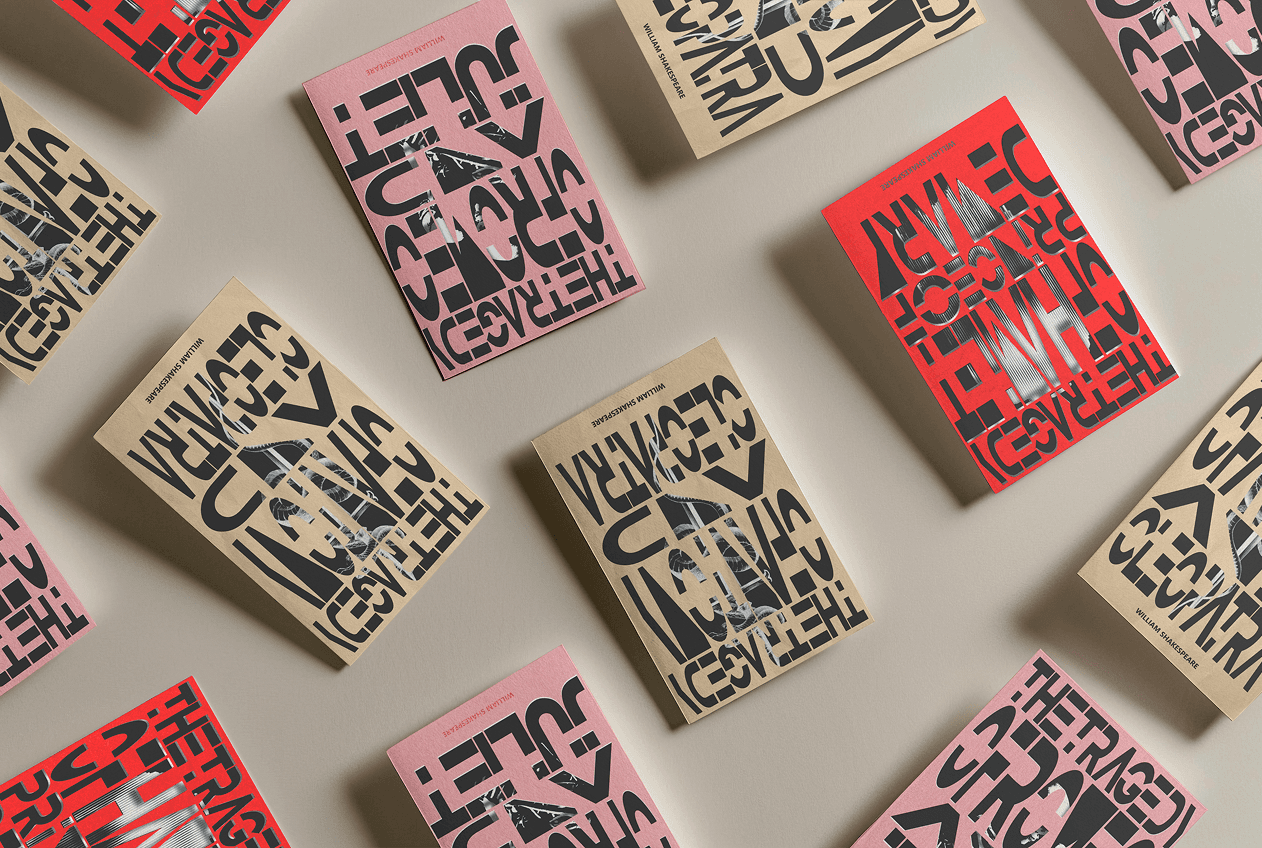
The defining visual feature of the collection is the die-cut cover design, where precise geometric window cuts in the front cover reveal symbolic artwork printed on the first interior page. This creates a dynamic, multi-layered interaction between the exterior jacket and the book's internal content.
Each title's hidden artwork uses stark black-and-white imagery to capture the central theme and ultimate tragedy of the play:
Hamlet: Features a solitary skull through the die-cut opening, symbolizing mortality, deep introspection, and existential dread.
Romeo and Juliet: Reveals two embracing skeletons in a kiss, representing eternal passion and a love that transcends death itself.
Antony and Cleopatra: Highlights a dagger entwined with a snake, representing the tragic demise of both lovers—Antony by the sword and Cleopatra by venom.
Color Systems & Narrative Tone
A deliberate color palette was established to give each volume a distinct identity while maintaining visual harmony across the set. High-contrast black (#000000) and crisp white (#FFFFFF) serve as the foundation for internal typography, ensuring maximum legibility and an uncluttered, modern layout.
The exterior covers utilize distinct background hues tailored to each story's emotional core:
Burgundy Red (
#800020): Selected for Hamlet to evoke passion, internal drama, and intense emotional conflict.Pale Pink (
#F4C2C2): Applied to Romeo and Juliet to convey romance, tenderness, and youthful vulnerability.Sand Yellow (
#F5DEB3): Chosen for Antony and Cleopatra to reflect the warmth, opulence, and historic light of ancient Egypt.


Interior Layout & Typography
The interior layout utilizes a 13 mm times x 10 mm grid with 3mm gutter spacing, maintaining strict alignment across every page spread. The typography relies on Times New Roman, a classic serif typeface chosen specifically for its superior legibility during extended reading sessions.
The serif structure guides the eye smoothly across text lines while projecting a refined, professional tone appropriate for theatrical dialogue. Additionally, the compact proportion of the typeface allows for optimal page real estate usage, balancing generous margins with a clean, readable text block.
Paper Choices & Special Finishes
The technical specifications prioritize both reader comfort and physical durability. The books are bound in a durable paperback pocket format 70gm off-white offset paper for internal pages), offering a lightweight, glare-free reading surface that feels comfortable in hand.
Selective spot varnish is applied to specific elements on the first interior page. This finish provides a subtle tactile texture and glossy sheen that catches the light through the cover's die-cut openings, adding tactile depth to the opening experience.
Promotional Pieces & Brand Mockups
To evaluate the collection as a complete commercial release, promotional assets and realistic mockups were produced. The identity system includes a custom minimalist portrait of William Shakespeare, applied across promotional shopping bags, bookmarks, and digital media campaigns.
Social media mockups showcase how the vibrant cover colors, die-cut patterns, and clean typography interact in real-world environments and online storefronts, confirming the collection's strong shelf appeal and brand recognition.


