5 min read
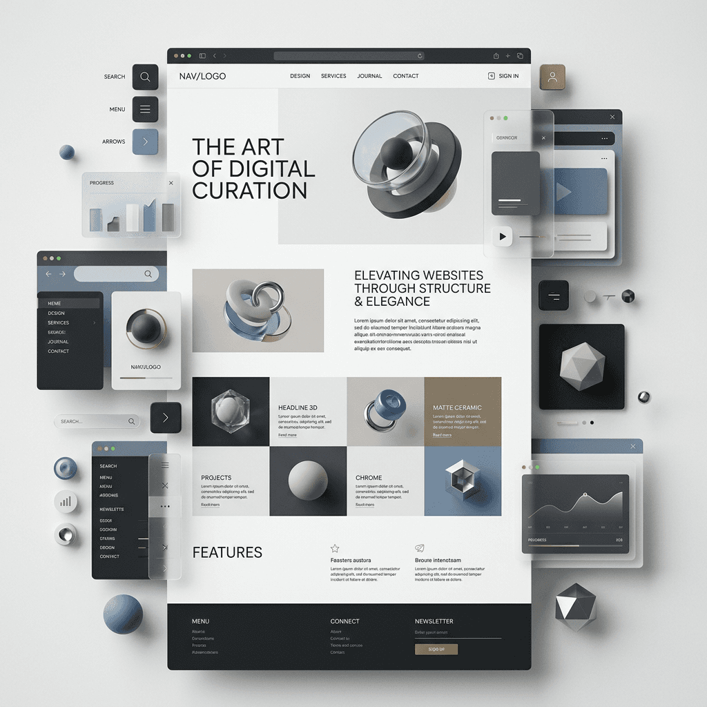
The Architecture of High-Converting Webflow Landing Pages
Combining 3D visual hooks, micro-interactions, and clear user psychology.
IA


Lexi Wang
AI Creative Specialist & Digital Designer
I help teams ship products faster, with research backed design that keeps users coming back.
A visually stunning website that fails to guide the user toward action is just an expensive digital poster. Whether building an e-commerce platform for an independent brand or a high-stakes corporate portal, great web design balances aesthetic delight with intuitive user navigation.
The Strategic Prompting Breakdown
Concise Messaging: Headlines should state clearly who you are, what you do, and why it matters—avoiding unnecessary fluff.
Spatial Impact: Using dynamic 3D assets or micro-animations created in Cinema 4D creates instant brand authority.
Scannable Hierarchy (Body Layout)
Interactive Feedback: Subtle hover states, smooth scroll triggers, and Webflow micro-animations provide continuous tactile feedback.
Grid Discipline: Clean typography and purposeful white space allow the eye to rest and absorb information effortlessly.
Purposeful CTA Placement
Commercial Alignment: Every interactive element must tie back to a clear business goal—whether that's booking a call, exploring a portfolio, or making a purchase.
Low Friction: Primary call-to-action buttons should be visually distinct (high contrast) and placed logically at natural decision points.