Nescafé Repackaging
A narrative-driven packaging redesign that transforms everyday instant coffee into an elevated, eco-luxury ritual inspired by the tactile sophistication of premium cigar cases.
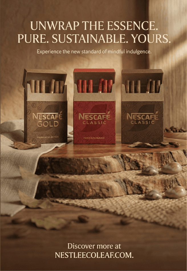
The core mission of this project was to take an accessible, everyday staple—instant coffee—and completely elevate its perceived value into the realm of "new luxury". Focusing on Nescafé, the redesign challenges the conventional visual codes of mass-market coffee packaging, which traditionally rely on functional glass jars or plastic wrappers that lack emotional depth. Inspired by the refined ritual of premium cigars, the conceptual identity transforms a quick routine into an intentional sensory experience. By replacing standard instant coffee sachets with individual cardboard tubes housed inside ergonomic, tactile cases, the packaging establishes a brand narrative centered around mindfulness, quality, and restraint.
Year
Client
Work type

Target Audience & Positioning
Positioned at the intersection of eco-consciousness and modern luxury, the collection is tailored for discerning urban consumers aged 25 to 55. These individuals view luxury not as flashiness or excess, but as deliberate craftsmanship, subtle detailing, and environmental alignment. They are willing to invest in premium experiences that respect circular economy principles without sacrificing design rigor. This project addresses a clear gap in the market: delivering a sophisticated, highly tactile identity for instant coffee that feels as curated as high-end niche perfumery or limited-edition boutique goods.
Materiality & Tactile Workflow
The tactile experience is driven by carefully chosen sustainable materials. The primary outer structure utilizes 360g Fedrigoni Materica paper—an eco-friendly, cotton-blend stock chosen for its deep fiber texture and structural strength. Rather than relying heavily on surface inks, a double-level blind embossing technique creates an intricate pattern of coffee beans across the box, transforming the surface into a purely physical sensation. Inside, the single-serve sticks are wrapped in 80g unbleached kraft paper featuring a specialized organic barrier coating, keeping moisture out while entirely eliminating single-use plastics.

Color Palette & Visual Identity
The color strategy bridges Nescafé’s heritage with a grounded, contemporary mood. The foundational palette relies on Deep Roasted Brown to communicate the richness of the blend, serving as the rich canvas for the embossed bean textures. The brand’s legacy red is modernized into a muted Garnet Red, maintaining brand recognition while signaling a more elevated product line. Warm Natural Kraft reflects the raw, unrefined structural elements, signaling circular design, while subtle Gold Hot Foil accents illuminate the typography and premium detailing, striking a balance between organic textures and metallic precision.
Visual Merchandising & Spatial Presence
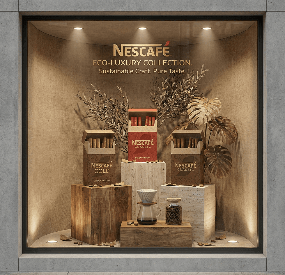
To project this visual identity into physical and digital spaces, visual merchandising displays and retail concepts were developed to echo the minimalist aesthetic. Point-of-sale structures and window displays utilize raw wood, natural linen, and warm directional spotlighting to create focused, gallery-like presentations. Combined with geometric secondary typography with generous letter-spacing, the packaging stands out on the shelf as an object of design. The final presentation successfully bridges sustainable material selection, 3D render mockups, and retail touchpoints into a unified vision of eco-luxury.


