Takashi Murakami Calendar
This project presents an artistic 2026 calendar design inspired by the iconic aesthetic of contemporary Japanese artist Takashi Murakami.
This project presents an artistic 2026 calendar design inspired by the iconic aesthetic of contemporary Japanese artist Takashi Murakami. Renowned for founding the Superflat postmodern movement, Murakami’s work bridges high art with pop culture, otaku subculture, and traditional Japanese motifs. His vibrant visual language—featuring smiling flowers and bold flat graphics—serves as the ideal foundation for a dynamic, year-round editorial piece. The project was developed as a collaborative creative effort by Chiara Covassi, Lexi Wang, Vittoria Sirtori, and Angela Parrilla. The core ambition was to translate Murakami's signature critique of consumerism and pop obsession into a functional, beautifully crafted desktop calendar.

Year
Client
Work type

Artistic Baseline & Source Reinterpretation
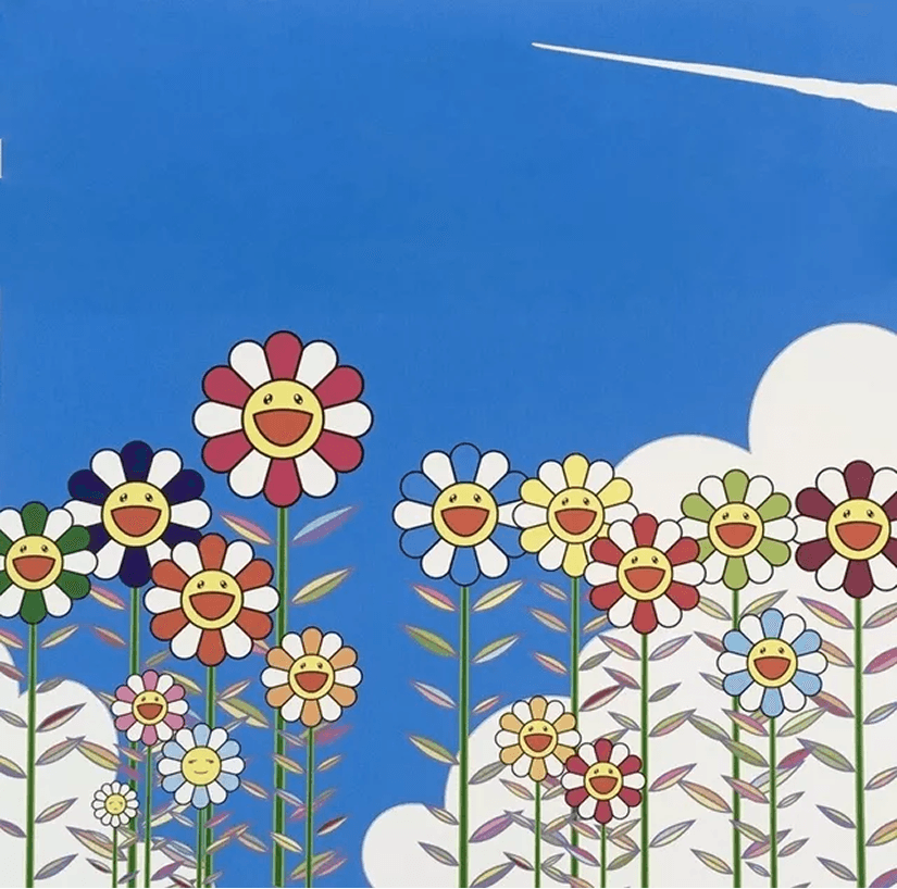
The visual foundation of the calendar draws directly from Murakami's celebrated artwork, "Vapor Trail In The Blue Summer Sky". Created through his Kaikai Kiki studio, the original piece exemplifies his Superflat philosophy by blending anime graphics with western pop art. It features his instantly recognizable smiling flowers set against a clear blue sky and soaring vapor trails.
Rather than simply replicating the original artwork across twelve months, the design team reinterpreted the scenery to mirror the changing seasons. Each selected month showcases an adapted environmental background that reflects seasonal transitions while preserving Murakami's distinctive graphic outlines and saturated palette.
Seasonal Visual Storytelling
To evoke a true sense of time passing, the core artwork was systematically modified across different seasonal milestones. For the January layout, the sky transforms into a cool, snow-dusted night scene where blue-toned smiling flowers emerge from icy drifts. April captures a blooming spring landscape filled with fresh greenery, rolling hills, and vibrant floral blossoms.
Moving into summer, August introduces a radiant sunburst horizon over coastal waters, complete with flowers wearing sunglasses to convey warm, energetic seasonal optimism. Finally, October shifts to an autumn palette featuring swirling winds, falling leaves, grounded mushrooms, and warm orange-toned trees, grounding the art in seasonal harmony.
Iterative Editorial Design Process
Developing the calendar required a comprehensive refinement process spanning layout structure, grid alignment, and visual hierarchy. Initial versions focused on establishing the placement of dates, bilingual proverbs, and artwork frames.
Feedback from early drafts led to significant improvements in date readability, margin balance, and header typography. The layout evolved from a rigid full-frame artwork layout into a clean, dual-section structure where artwork and functional calendar grids coexist harmoniously.


Print Prototyping & Physical Mockups
To ensure the digital design translated seamlessly into a real-world product, physical desktop mockups were produced. The calendar was designed in a horizontal desktop format bound by a black double-loop wire-o spine and supported by a sturdy white tent base.
The final rendered mockups demonstrate how the vibrant colors, crisp line art, and textured backgrounds interact with real-world studio lighting. From coffee table settings to office workspaces, the physical mockups showcase the product as both a functional planning tool and a colorful desk exhibition.